Zain Sheikh
Wednesday, 29 April 2015
Tuesday, 28 April 2015
Thursday, 12 February 2015
Feedback From Target Audience
Feedback from Target Audience
I asked 30 people the following questions...
Questions
that were asked to my target audience:
1. Do you like
the name of the magazine?
2. Does the
cover make you want to look inside the magazine?
3. Do you
think the contents page is eye catching?
4. Does the
masthead/coverline catch your attention?
5. Does the
image relate well to the article on the double page spread?
6. Do you like the colour coordination?
7. Does the image work well with the
colour and format?
8. What age group do you think the magazine
is best aimed at?
9. What feature of the front cover
attracts you the most?
10. What
feature of the contents page attracts you the most?
11. What
feature of the double page spread attracts you the most?
12. What
could be improved?
13. Which
one do you prefer? (Front Cover)
14. Which one do you prefer? (Contents Page)
15. Which one do you prefer? (Double Page Spread)
Overall Summary
I have gathered all my research and I have come to a
conclusion that there was a balance of choices and gave me a vast idea of what
my target audience liked and disliked. As I look at my graph I can tell that,
the public liked my magazine and the layout including the colour contrast.
Majority of the public liked the name of my magazine which is Elaborate which
means going in to detail, and that is what my magazine is about giving
information of latest gossip of celebrities. I asked the public whether they
found the contents page eye catching, and according to the public they liked my
contents. This was a good start because that’s what I want, my page to
eye-catching for the readers; making them want to continue reading.
I wanted to know whether my masthead/cover line was eye
catching and grabbed the reader’s attention, and as you can see from my graph
there was a slight differ between yes or no. But majority of the people found
the masthead and cover line eye-catching. This gave me a good idea of roughly
what my audience was looking for. The public believed that the images went well
with the article and that it all flowed and linked. This told me that my
magazine is going the right way without any misunderstanding whilst looking at
the magazine, making me notice that the public understood well, on what was on
the magazine. When I did my drafts for my magazine and wanted to make sure that
the colour coordination of the magazine flowed well and didn't have a variety
of colours on the magazine, making it just one specific colour. The graph
feedback from the public told me that they liked the colour coordination; this
told me my colour for my magazine wasn't too much for the eye but was just
right for the public’s eye.
I wanted my magazine to be great for my target audience, but
I wanted to know if the target audience was the right choice for my magazine.
As my preferred target audience was 18 to 24 years old. So I decided in order
to make this magazine right for my target audience, I wanted to ask the public
what they thought and majority of the people had said 18 to 24. Which I
personally thought was a reasonable age for my target audience. This made me
realise that I needed to make my magazine more mature but with a bit of kick to
it, to get the readers going.
I didn't want my feedback form to be biased and not ask the
audience what should be improved, so to get an exact answer and get a second
choice from the public. I wanted to know what should be improved and the public
thought that the styling and formatting should be improved, seeing the results
for improvement I looked at the whole result as one and looked at what my
target audience wanted and what they disliked and liked. And by looking at this
it helped me make few adjustments and rearrangements to my magazine, making it
look eye catching for my readers.
I then finally asked the most important question which I
wanted to know from my audience, which was which drafts for cover, contents and
double page spread they preferred. It was a clash between both draft 1 and 2
but I can say overall by looking at my graph that, my audience liked the idea
of the first draft but to get the idea of both parts of my audience I decided
to add each different feature from my second draft into my first draft. So I
had to weigh out from both parts of my audience, and decided to adjust parts of
the magazine that the other half of the public disagreed to, and didn’t just
specifically look at what one specific category had to say, making it a
reliable source.
This has affected my final design in a number of ways. It has
given me a vast idea on what my target audience likes and dislikes. This is
very beneficial as well as crucial as it helps me create my final design. This
had given me a wider view of what my audience is looking for. From this
information I have learned what I need to improve on and what needs to stay the
same. I have taken all the feedback into consideration and shall put this
feedback to work. Making the magazine just the way my target audience wants it,
taking their thoughts and opinions into account, in order to make my magazine a
best seller.
Annotations of drafts
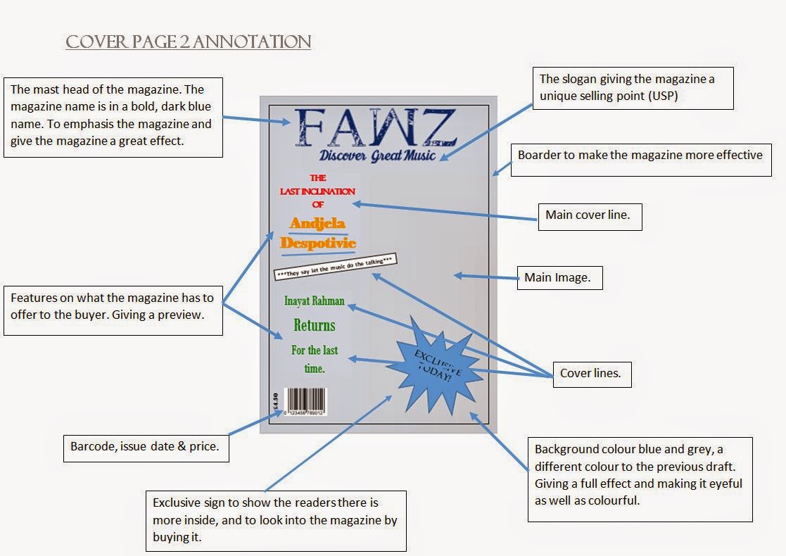
Front Cover Annotation
Contents Annotation
Double Page Spread Annotation
These
are the annotations I have done for the cover, contents and double page spread.
It gives detailed information about what each part of the draft is about.
Drafts of magazine
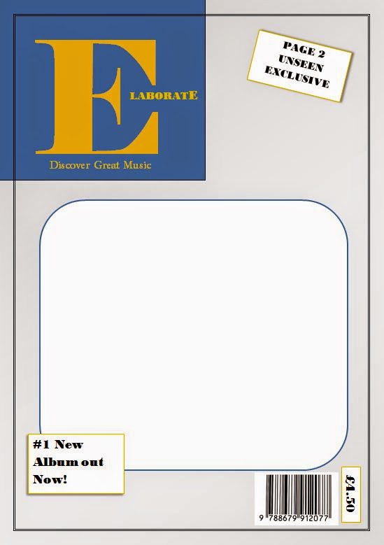
Front Cover Drafts
Contents Drafts
Double Page Spread Drafts
I
started off with many drafts for my cover, contents and double page spread. I had
loads of ideas, but I felt as if it was not working out for me and emphasizing
what my magazine was all about which was a music magazine for Hip Hop and
R&B/Rap. I went for all types of layout in order to make my magazine
effective. In the end after all the drafts, my feedback from my survey told me
that each layout for my cover, contents and double page spread was 50/50. So
what I had decided was that I should take each part of each page and put it all
together on to my real magazine. The draft shows that after developing again
and again with the layouts it helped me expand my knowledge on what I wanted as
my final magazine.
Analysis of Images - Before & After
Front Cover
Before
After
This image
will be presented as my main image for my front cover, the reason I chose this
image is to make the reader have their eyes on just one specific image, and
make them think why this image was chosen. Leading them to wanting to find out
by buying the magazine. The first thing which I had done to improve my picture
and make it more effective, is that I cropped out the person so there is no
faulty background image and added her onto a grey background. This makes the
clothes she is wearing stand out and reflect back on to the grey background,
making it more eye catching. Using just 2 different contrasts on the image
which is grey and green with a hint of black. I then to make the image more
effective, I changed the contrast and brightness a little bit to make sure that
the colouring of the image is right and not to dull and bland.
Contents - Picture 1
Before
After
In
this particular image which I will be using for my contents page, was edited as
well. In order to make the image stand out, I cropped the image to take out any
unwanted parts. Which made the image look unrealistic; I then changed the
brightness and contrast of the image to make it have a full effect and make it
eye catching. Not making it too unrealistic but was going for the more
realistic look to the image.
Contents - Picture 2
Before
After
This
image didn’t have many changes to it as I was going for more of a natural look
to this image, with just a few adjustments such as cropping unwanted parts of
the image; including changes to the colour of the image. As I did modify the
contrast and brightness of this particular image, without having a different
backdrop for this image. Allowing the image to talk for itself and get the
readers thinking.
Contents - Picture 3
Before
After
I
did the same with the following image, which will also be for the contents. I
cropped the image out to make it narrower, so the reader is focused straight at
the image. Which I then cropped them out and placed them in the London eye pod,
having the view of London in the background. Making the image more realistic
and effective. As well as changing the contrast and brightness so the image has
the full effect, making it eye catching.
Double Page Spread - Main Image
Before
After
This image
will be used for my double page spread. What I have done in order for my image
to stand out and be more effective is that I have cropped my image. Cancelling
out unwanted parts of the image, I then changed the contrast and brightness to
make sure my image has a full effect by adjusting the contrast and brightness.
Making sure that the image looks more enhanced and eye catching for my readers,
for when he goes on to my double page spread; taking the whole page up, making him
the centre of attention. As well as making they want to read my article on
rather than just admiring the image.
Double Page Spread - Picture 1
Before
After
When
I first took this image, it was dull and the colour was dull and this did not
let the image stand out. For this reason I made a few edits on the image such
as cropping the background out and leaving him on a plain white background.
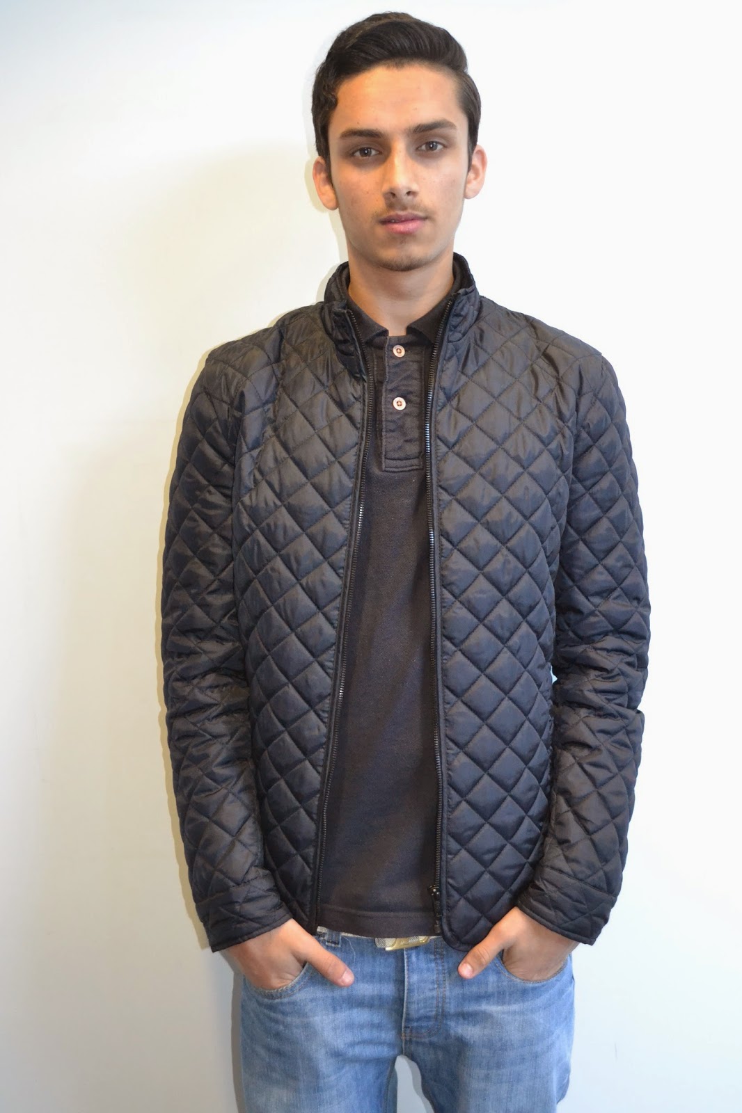
This helped to enhance the colours of his clothing. To adjust the image I
changed the brightness and contrast to make his clothing do the talking.
Double Page Spread - Picture 2
Before
After
In
this image I did not do much change as I did the same adjustments from the
previous image. I changed the contrast and brightness of the image as well as
cropping and photo shopping the image to make the image eye-catching by getting
rid of the shadow behind.
Double Page Spread - Picture 3
Before
After
This
image I edited the brightness and contrast and cropped the unwanted background
and left just the artist on a plain background to make sure the image stands
out well. I also sharpened the colours to make it more attractive and appealing
and lightened a few areas to balance out the contrast.
Subscribe to:
Comments (Atom)


