Front Cover
Before
After
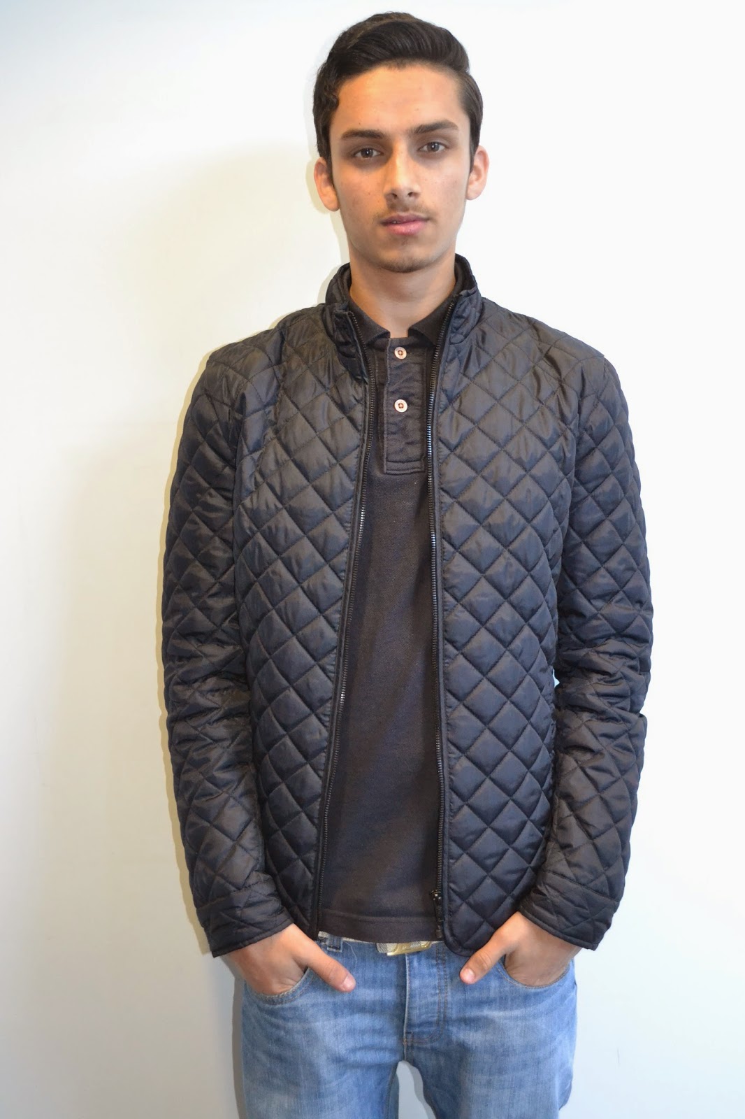
This image
will be presented as my main image for my front cover, the reason I chose this
image is to make the reader have their eyes on just one specific image, and
make them think why this image was chosen. Leading them to wanting to find out
by buying the magazine. The first thing which I had done to improve my picture
and make it more effective, is that I cropped out the person so there is no
faulty background image and added her onto a grey background. This makes the
clothes she is wearing stand out and reflect back on to the grey background,
making it more eye catching. Using just 2 different contrasts on the image
which is grey and green with a hint of black. I then to make the image more
effective, I changed the contrast and brightness a little bit to make sure that
the colouring of the image is right and not to dull and bland.
Contents - Picture 1
Before
After
In
this particular image which I will be using for my contents page, was edited as
well. In order to make the image stand out, I cropped the image to take out any
unwanted parts. Which made the image look unrealistic; I then changed the
brightness and contrast of the image to make it have a full effect and make it
eye catching. Not making it too unrealistic but was going for the more
realistic look to the image.
Contents - Picture 2
Before
After
This
image didn’t have many changes to it as I was going for more of a natural look
to this image, with just a few adjustments such as cropping unwanted parts of
the image; including changes to the colour of the image. As I did modify the
contrast and brightness of this particular image, without having a different
backdrop for this image. Allowing the image to talk for itself and get the
readers thinking.
Contents - Picture 3
Before
After
I
did the same with the following image, which will also be for the contents. I
cropped the image out to make it narrower, so the reader is focused straight at
the image. Which I then cropped them out and placed them in the London eye pod,
having the view of London in the background. Making the image more realistic
and effective. As well as changing the contrast and brightness so the image has
the full effect, making it eye catching.
Double Page Spread - Main Image
Before
After
This image
will be used for my double page spread. What I have done in order for my image
to stand out and be more effective is that I have cropped my image. Cancelling
out unwanted parts of the image, I then changed the contrast and brightness to
make sure my image has a full effect by adjusting the contrast and brightness.
Making sure that the image looks more enhanced and eye catching for my readers,
for when he goes on to my double page spread; taking the whole page up, making him
the centre of attention. As well as making they want to read my article on
rather than just admiring the image.
Double Page Spread - Picture 1
Before
After
When
I first took this image, it was dull and the colour was dull and this did not
let the image stand out. For this reason I made a few edits on the image such
as cropping the background out and leaving him on a plain white background.
This helped to enhance the colours of his clothing. To adjust the image I
changed the brightness and contrast to make his clothing do the talking.
Double Page Spread - Picture 2
Before
After
In
this image I did not do much change as I did the same adjustments from the
previous image. I changed the contrast and brightness of the image as well as
cropping and photo shopping the image to make the image eye-catching by getting
rid of the shadow behind.
Double Page Spread - Picture 3
Before
After
This
image I edited the brightness and contrast and cropped the unwanted background
and left just the artist on a plain background to make sure the image stands
out well. I also sharpened the colours to make it more attractive and appealing
and lightened a few areas to balance out the contrast.


No comments:
Post a Comment